Blog
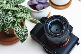
Professional methods for more accurate printed photographs

Do you want good printed photographs? Follow these steps for reliable print exposure and color.
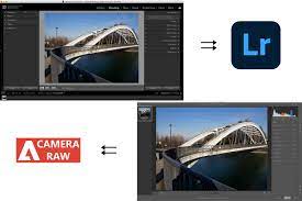
Creating quality prints is a skill of its own in the professional world of photography. Producing good colors and accurately exposing your pictures in-camera, then post-processing them is useless effort if the final result does not match what you see on the screen.
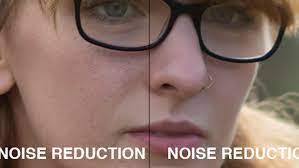
For printed photographs to process, we need to create the same color depth and a great balance of highlights and need to have a streamlined workflow from shoot to output.
For photographers who are experienced in the field this is likely old news – even some failed attempts in printing or several disappointing returns from online print places will be learning in print management. However, there are few steps that should be taken to make sure even better continuity of tone and more accurate results.
Lets look at some simple and effective color control fundamentals that, while obvious in hindsight, can be overlooked by many!
Familiar surroundings
Where your editing is as important as how you process your images there is no hidden thing that the editing of images should ideally be done in neutral settings, in a room with walls and no direct light falling on the screen. Whereas, continuity is critical – find a neutral place and edit all your images in that. Changing places, even within a room, can have effects on how you see the colors in your picture.
Calibrate regularly
Monitoring calibration is an important point in producing reliable colors. But the regularity with which you do this is also needs to be kept in view. Many photographers calibrate their screen, then don’t do repeat that. This lets time for the monitor to shift again. So, calibrate as part of your regular work may be bi-weekly.
Monitor to camera
Have you ever thought of your computer monitor and comparing it to your camera screen? Not only there are differences in how they represent color but camera screen likely only shows you a JPEG preview of your RAW files. Select a flat JPEG profile in-camera, then compare a reference image on both your camera LCD and editing screen, to identify discrepancies. This will help you capture more reliable colors in the field, minimizing how much later color adjustment is required, and reducing the likelihood of unwanted settings making it to print.
Compare prints to screen
If you have any reference prints, after employing some of the other steps featured, compare those to the final images on-screen. This will help you see where you have over-compensated or under-compensated for color or exposure issues. Shadows seem dark in print, so this process enables you to adjust your editing approach for that specific paper and printer combination.
Adjust screen for setting
Sometimes you have to leave your common editing space. When this is unresistable, take note of the places or similar lighting conditions you find yourself working with– this can enable you to adjust the color balance of your system’s screen, to more precisely adjust for the change. The aim of this activity is to reproduce the screen appearance in your standard editing area, giving you more color consistency.
When you understand the balance between your perception of color in your images and how this translates through a printer, onto paper, you can make adjustments to edit your image. This helps gain more predictable colors and fewer wasted prints!
For more information or buying best cameras or camera accessories in Karachi please contact us.